Find Differences Output
Log output:
- Description of the search (strains used)
- All the same – Name(s) of strains [# seq that can be different : # seq in the column]
- All different – Name(s) of strains compared against [0 : tolerance level]
- Location of differences: the number following the location specifies the number of other strains that is the same in this location and that is not in the ‘all the same’ category (names of the matching strains will be printed beside the location)
- Total number of differences found
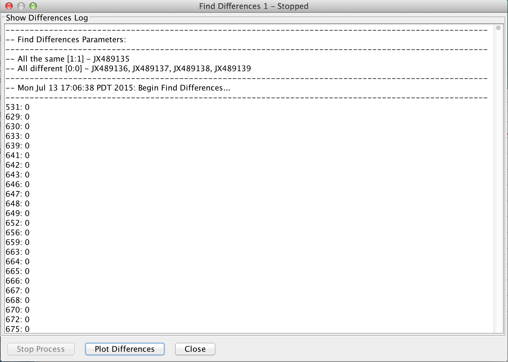
This data can be plotted on a graph by clicking the ‘Plot Differences’ button found at the bottom of the log window.
Graph output:
The nuber of differences i.e. SNPs are plotted along the Y-axis and sequence position along the X-axis. The graph can be manipulated further by adjusting the ‘Bin size’ and ‘Offset’. The bin size breaks up the alignment into equal sized segments, which are used as boundary locations for tallying the number of SNPs. In the example above, the graph is plotting the number of SNPs/differences found within each 1893 nt stretch from the start of the alignment. With the offset set at 0 the groupings go from 1- 1894, 20835-22728… until the reaching the end. Increasing the offset to 1 sets the bins to go from 2-1895, 20836-22729… to the end. The first nucleotide is still included in the graph after offsetting, but belongs in its own bin of size 1. Changing the offset allows the user to scan through the alignment by shifting the bins, so that if any spikes in the number of SNPs/differences was interrupted by a bin size boundary the spike would become evident as the bin location is shifted. The Chart types function allows your plot to be displayed as an area, bar or line chart.
Info: This graph works off of the log generated from “Find Differences”. Simple, select the tolerated genomes you wish to be plotted form the check box list.
Bin Count: The number of bins/windows; eg. 0f 100 bins for a 200,000 nucleotide sequence, then the bins would be equal to 2000 bins.
Offset: Offset of the bin count range.
Perfect Match: Refers to the entries in the log which contain 0 tolerated genomes. Perfect matches are always plotted regardless of inclusion or exclusion.
Inclusive: This implies the graph will be plotted from log entries which contain any tolerated genomes from you selection.
Exclusive: This implies the graph will be plotted from log entries containing exactly your selection.
Example: If genome 3, 4, 5 are selected for plotting. The Inclusive function is plotting any combination of the 3 genomes being of = {(3,4,5), (3,4), (3,5), (4,5), (3), (4), (5)} and Exclusive function is the plotting of exactly the genomes selected = {(3,4,5)}.
Visualization
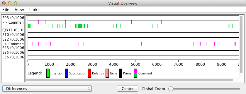
In the main Base-By-Base window go into the Reports menu > Visual Summary.
The window that opens will display all differences/SNPs found based on the color selected by the user during the find differences search.
The find differences results are printed in the comment row below the strain name the search was assigned to. In the image above E03 was run against all other strains with a tolerance of 0 and the resulting pink bars in its comment section show where the differences were found. The lime green color was a test run to determine what E03 and E22 shared that no other strain in the data set contained.
What can this show?
Cases where few unique SNPs or differences are found in large segments of an alignment could indicate sites of recombination, alternately a distinct region with a very high SNP count could implicate a hotspot of genome variation when comparing closely related viruses.
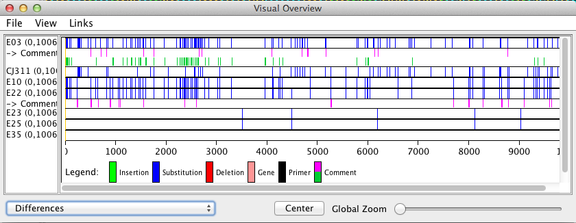
To remove the blue substitution bars go to View > and click on ‘Show differences’ so that it is deselected.